Content
It includes the breadcrumbs, the page title and the page main content.
To create a new page, you can use
pages_blank_page.html
which provides basic page layout which you can extend and modify further.
Responsive Admin Template build with Twitter Bootstrap 3
All template pages have a fixed structure, including the following elements:
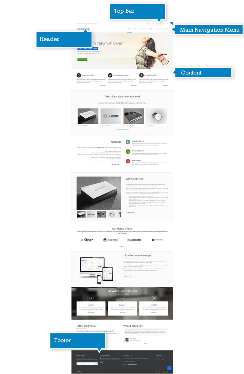
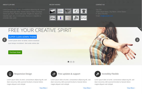
The template Header includes the logo, the Top Bar, the Main Menu. It may also include a Sliding Bar.
<!-- start: HEADER --> <header> <!-- start: SLIDING BAR (SB) --> <div id="slidingbar-area"> <div id="slidingbar" style="display: none;"> <!-- start: SLIDING BAR FIRST COLUMN --> <div class="col-md-4 col-sm-4"> <h2>About Clip-One</h2> <p> Lorem ipsum dolor sit amet, consectetuer adipiscing elit. Aenean commodo ligula eget dolor. Aenean massa. Nulla consequat massa quis enim. Donec pede justo, fringilla vel, aliquet nec, vulputate eget, arcu. In enim justo, rhoncus ut, imperdiet a, venenatis vitae, justo. </p> </div> <!-- end: SLIDING BAR FIRST COLUMN --> <!-- start: SLIDING BAR SECOND COLUMN --> <div class="col-md-4 col-sm-4"> <h2>Recent Works</h2> <div class="blog-photo-stream margin-bottom-30"> <ul class="list-unstyled"> <li> <a href="#"><img src="assets/images/image01.jpg" alt=""></a> </li> <li> <a href="#"><img src="assets/images/image02.jpg" alt=""></a> </li> <li> <a href="#"><img src="assets/images/image03.jpg" alt=""></a> </li> <li> <a href="#"><img src="assets/images/image04.jpg" alt=""></a> </li> <li> <a href="#"><img src="assets/images/image05.jpg" alt=""></a> </li> <li> <a href="#"><img src="assets/images/image06.jpg" alt=""></a> </li> <li> <a href="#"><img src="assets/images/image07.jpg" alt=""></a> </li> <li> <a href="#"><img src="assets/images/image08.jpg" alt=""></a> </li> <li> <a href="#"><img src="assets/images/image09.jpg" alt=""></a> </li> <li> <a href="#"><img src="assets/images/image10.jpg" alt=""></a> </li> </ul> </div> </div> <!-- end: SLIDING BAR SECOND COLUMN --> <!-- start: SLIDING BAR THIRD COLUMN --> <div class="col-md-4 col-sm-4"> <h2>Contact Us</h2> <address class="margin-bottom-40"> Clip-One <br> 12345 Street Name, City Name, United States <br> P: (641)-734-4763 <br> Email: <a href="#"> info@example.com </a> </address> </div> <!-- end: SLIDING BAR THIRD COLUMN --> </div> <!-- start: SLIDING BAR TOGGLE BUTTON --> <a class="sb_toggle" href="#"> </a> <!-- end: SLIDING BAR TOGGLE BUTTON --> </div> <!-- end: SLIDING BAR --> <!-- start: TOP BAR --> <div id="topbar" class="clearfix "> <div class="container"> <div class="row"> <div class="col-sm-6"> <!-- start: TOP BAR CALL US --> <div class="callus"> Call Us: (641)-734-4763 - Mail: <a href="mailto:info@example.com"> info@example.com </a> </div> <!-- end: TOP BAR CALL US --> </div> <div class="col-sm-6"> <!-- start: TOP BAR SOCIAL ICONS --> <div class="social-icons"> <ul> <li data-placement="bottom" data-original-title="Twitter" class="social-twitter tooltips"> <a href="http://www.twitter.com" target="_blank"> Twitter </a> </li> <li data-placement="bottom" data-original-title="Dribbble" class="social-dribbble tooltips"> <a href="http://dribbble.com" target="_blank"> Dribbble </a> </li> <li data-placement="bottom" data-original-title="Facebook" class="social-facebook tooltips"> <a href="http://facebook.com" target="_blank"> Facebook </a> </li> <li data-placement="bottom" data-original-title="Google" class="social-google tooltips"> <a href="http://google.com" target="_blank"> Google+ </a> </li> <li data-placement="bottom" data-original-title="LinkedIn" class="social-linkedin tooltips"> <a href="http://linkedin.com" target="_blank"> LinkedIn </a> </li> <li data-placement="bottom" data-original-title="YouTube" class="social-youtube tooltips"> <a href="http://youtube.com/" target="_blank"> YouTube </a> </li> <li data-placement="bottom" data-original-title="RSS" class="social-rss tooltips"> <a href="#" target="_blank"> RSS </a> </li> </ul> </div> <!-- end: TOP BAR SOCIAL ICONS --> </div> </div> </div> </div> <!-- end: TOP BAR --> <div class="navbar navbar-default navbar-fixed-top space-top" role="navigation" style="top: 40px; height: 90px; line-height: 88px;"> <!-- start: TOP NAVIGATION CONTAINER --> <div class="container"> <div class="navbar-header"> <!-- start: RESPONSIVE MENU TOGGLER --> <button type="button" class="navbar-toggle" data-toggle="collapse" data-target=".navbar-collapse"> <span class="sr-only">Toggle navigation</span> <span class="icon-bar"></span> <span class="icon-bar"></span> <span class="icon-bar"></span> </button> <!-- end: RESPONSIVE MENU TOGGLER --> <!-- start: LOGO --> <a href="index.html" class="navbar-brand" style="font-size: 30px;"> CLIP<i class="clip-clip" style="font-size: 25px;"></i>ONE </a> <!-- end: LOGO --> </div> <div class="navbar-collapse collapse"> <ul class="nav navbar-nav navbar-right"> <li class="active"> <a href="index.html" style="height: 90px; line-height: 88px;"> Home </a> </li> <li class="dropdown"> <a data-hover="dropdown" data-toggle="dropdown" href="#" class="dropdown-toggle" style="height: 90px; line-height: 88px;"> Pages <b class="caret"></b> </a> <ul class="dropdown-menu"> <li> <a href="pages_about.html"> About Us </a> </li> <li> <a href="pages_team.html"> Team </a> </li> <li> <a href="pages_services.html"> Services </a> </li> <li> <a href="pages_careers.html"> Careers </a> </li> <li> <a href="pages_faq.html"> Faq </a> </li> <li> <a href="pages_contact.html"> Contact Us </a> </li> </ul> </li> <li class="dropdown mega-menu"> <a data-hover="dropdown" data-toggle="dropdown" href="#" class="dropdown-toggle" style="height: 90px; line-height: 88px;"> Features <b class="caret"></b> </a> <ul class="dropdown-menu"> <li> <!-- start: MEGA MENU CONTENT --> <div class="mega-menu-content"> <div class="row"> <div class="col-sm-3"> <ul class="sub-menu"> <li> <span class="mega-menu-sub-title">Main Features</span> <ul class="sub-menu"> <li> <a href="features_icons.html"> Icons </a> </li> <li> <a href="features_buttons.html"> Buttons </a> </li> <li> <a href="features_animations.html"> Animations </a> </li> <li> <a href="features_typograpy.html"> Typograpy </a> </li> <li> <a href="features_grid_system.html"> Grid System </a> </li> </ul> </li> </ul> </div> <div class="col-sm-3"> <ul class="sub-menu"> <li> <span class="mega-menu-sub-title">Headers and Footers</span> <ul class="sub-menu"> <li> <a href="index.html"> Header Version 1 </a> </li> <li> <a href="index_header_2.html"> Header Version 2 </a> </li> <li> <a href="index_header_3.html"> Header Version 3 </a> </li> <li> <a href="index.html#footer"> Footer Version 1 </a> </li> <li> <a href="index_footer_2.html#footer"> Footer Version 2 </a> </li> </ul> </li> </ul> </div> <div class="col-sm-3"> <ul class="sub-menu"> <li> <span class="mega-menu-sub-title">Extra</span> <ul class="sub-menu"> <li> <a href="extra_search_result.html"> Search Result </a> </li> <li> <a href="extra_pricing_table.html"> Pricing Tables </a> </li> <li> <a href="extra_404.html"> 404 </a> </li> <li> <a href="extra_500.html"> 500 </a> </li> </ul> </li> </ul> </div> <div class="col-sm-3"> <ul class="sub-menu"> <li> <span class="mega-menu-sub-title">Blog</span> <ul class="sub-menu"> <li> <a href="blog_page.html"> Blog Page </a> </li> <li> <a href="blog_post.html"> Blog Post </a> </li> </ul> </li> </ul> </div> </div> </div> <!-- end: MEGA MENU CONTENT --> </li> </ul> </li> <li class="dropdown"> <a data-hover="dropdown" data-toggle="dropdown" href="#" class="dropdown-toggle" style="height: 90px; line-height: 88px;"> Portfolio <b class="caret"></b> </a> <ul class="dropdown-menu"> <li> <a href="portfolio_example1.html"> 4 Columns Portfolio </a> </li> <li> <a href="portfolio_example2.html"> 3 Columns Portfolio </a> </li> <li> <a href="portfolio_example3.html"> 2 Columns Portfolio </a> </li> <li> <a href="portfolio_item.html"> Portfolio Item </a> </li> </ul> </li> <li> <a href="../admin/clip-one/index.html" target="_blank" style="height: 90px; line-height: 88px;"> Admin Theme </a> </li> <li class="menu-search"> <!-- start: SEARCH BUTTON --> <a data-toggle="popover" data-placement="bottom" href="#" style="height: 90px; line-height: 88px;"> <i class="clip-search-3"></i> </a> <!-- end: SEARCH BUTTON --> <!-- start: SEARCH POPOVER --> <div class="popover bottom search-box"> <div class="arrow"></div> <div class="popover-content"> <!-- start: SEARCH FORM --> <form action="#" id="searchform" class=""> <div class="input-group"> <input type="text" placeholder="Search" class="form-control"> <span class="input-group-btn"> <button type="button" class="btn btn-main-color btn-squared"> <i class="clip-search-3"></i> </button> </span> </div> </form> <!-- end: SEARCH FORM --> </div> </div> <!-- end: SEARCH POPOVER --> </li> </ul> </div> </div> <!-- end: TOP NAVIGATION CONTAINER --> </div> </header> <!-- end: HEADER -->
The Sliding Bar includes additional elements compared to the Main Menu.
In this example it includes:
According to your needs, you can customize its content.
<!-- start: SLIDING BAR (SB) -->
<div id="slidingbar-area">
    <div id="slidingbar" style="display: none;">
        <!-- start: SLIDING BAR FIRST COLUMN -->
        <div class="col-md-4 col-sm-4">
            <h2>About Clip-One</h2>
            <p>
                Lorem ipsum dolor sit amet, consectetuer adipiscing elit. Aenean commodo ligula eget dolor. Aenean massa.
                Nulla consequat massa quis enim.
                Donec pede justo, fringilla vel, aliquet nec, vulputate eget, arcu.
                In enim justo, rhoncus ut, imperdiet a, venenatis vitae, justo.
            </p>
        </div>
        <!-- end: SLIDING BAR FIRST COLUMN -->
        <!-- start: SLIDING BAR SECOND COLUMN -->
        <div class="col-md-4 col-sm-4">
            <h2>Recent Works</h2>
            <div class="blog-photo-stream margin-bottom-30">
                <ul class="list-unstyled">
                    <li>
                        <a href="#"><img src="assets/images/image01.jpg" alt=""></a>
                    </li>
                    <li>
                        <a href="#"><img src="assets/images/image02.jpg" alt=""></a>
                    </li>
                    <li>
                        <a href="#"><img src="assets/images/image03.jpg" alt=""></a>
                    </li>
                    <li>
                        <a href="#"><img src="assets/images/image04.jpg" alt=""></a>
                    </li>
                    <li>
                        <a href="#"><img src="assets/images/image05.jpg" alt=""></a>
                    </li>
                    <li>
                        <a href="#"><img src="assets/images/image06.jpg" alt=""></a>
                    </li>
                    <li>
                        <a href="#"><img src="assets/images/image07.jpg" alt=""></a>
                    </li>
                    <li>
                        <a href="#"><img src="assets/images/image08.jpg" alt=""></a>
                    </li>
                    <li>
                        <a href="#"><img src="assets/images/image09.jpg" alt=""></a>
                    </li>
                    <li>
                        <a href="#"><img src="assets/images/image10.jpg" alt=""></a>
                    </li>
                </ul>
            </div>
        </div>
        <!-- end: SLIDING BAR SECOND COLUMN -->
        <!-- start: SLIDING BAR THIRD COLUMN -->
        <div class="col-md-4 col-sm-4">
            <h2>Contact Us</h2>
            <address class="margin-bottom-40">
                Clip-One
                <br>
                12345 Street Name, City Name, United States
                <br>
                P: (641)-734-4763
                <br>
                Email:
                <a href="#">
                    info@example.com
                </a>
            </address>
        </div>
        <!-- end: SLIDING BAR THIRD COLUMN -->
    </div>
    <!-- start: SLIDING BAR TOGGLE BUTTON -->
    <a class="sb_toggle" href="#">
    </a>
    <!-- end: SLIDING BAR TOGGLE BUTTON -->
</div>
<!-- end: SLIDING BAR -->
The Top Bar of this template includes the company contact info and a list of a major Social Networks buttons.
According to your needs, you can customize its contents.
<!-- start: TOP BAR -->
<div id="topbar" class="clearfix ">
    <div class="container">
        <div class="row">
            <div class="col-sm-6">
                <!-- start: TOP BAR CALL US -->
                <div class="callus">
                    Call Us: (641)-734-4763 - Mail:
                    <a href="mailto:info@example.com">
                        info@example.com
                    </a>
                </div>
                <!-- end: TOP BAR CALL US -->
            </div>
            <div class="col-sm-6">
                <!-- start: TOP BAR SOCIAL ICONS -->
                <div class="social-icons">
                    <ul>
                        <li data-placement="bottom" data-original-title="Twitter" class="social-twitter tooltips">
                            <a href="http://www.twitter.com" target="_blank">
                                Twitter
                            </a>
                        </li>
                        <li data-placement="bottom" data-original-title="Dribbble" class="social-dribbble tooltips">
                            <a href="http://dribbble.com" target="_blank">
                                Dribbble
                            </a>
                        </li>
                        <li data-placement="bottom" data-original-title="Facebook" class="social-facebook tooltips">
                            <a href="http://facebook.com" target="_blank">
                                Facebook
                            </a>
                        </li>
                        <li data-placement="bottom" data-original-title="Google" class="social-google tooltips">
                            <a href="http://google.com" target="_blank">
                                Google+
                            </a>
                        </li>
                        <li data-placement="bottom" data-original-title="LinkedIn" class="social-linkedin tooltips">
                            <a href="http://linkedin.com" target="_blank">
                                LinkedIn
                            </a>
                        </li>
                        <li data-placement="bottom" data-original-title="YouTube" class="social-youtube tooltips">
                            <a href="http://youtube.com/" target="_blank">
                                YouTube
                            </a>
                        </li>
                        <li data-placement="bottom" data-original-title="RSS" class="social-rss tooltips">
                            <a href="#" target="_blank">
                                RSS
                            </a>
                        </li>
                    </ul>
                </div>
                <!-- end: TOP BAR SOCIAL ICONS -->
            </div>
        </div>
    </div>
</div>
<!-- end: TOP BAR -->
It includes the breadcrumbs, the page title and the page main content.
To create a new page, you can use
pages_blank_page.html
which provides basic page layout which you can extend and modify further.
There are two ways to animate the elements appearing on the screen when you scroll the page.
In order to animate a single element, add the class “animate-if-visible” to the element. For example, if you would like to animate a picture, proceed as follows:
<img class="animate-if-visible">
In order to animate multiple elements individually, add the class "animate-group" to the main element and the class "animate" to the child elements. For example:
<div class="animate-group"> <img class="animate "> <img class="animate "> <img class="animate "> </div>
In both cases, the default animation will be “fadeIn”. Here is a list of the different animations
To change the animation, just add the attribute “data-animation-options” to the element and specify the animation you would like to use. For example:
<img class="animate-if-visible" data-animation-options="{‘animation’:’flip’}">
Or:
<div class="animate-group">
<img class="animate " data-animation-options="{‘animation’:’flip’}">
<img class="animate " data-animation-options="{‘animation’:’tada’ }">
<img class="animate " data-animation-options="{‘animation’:’swing’}">
</div>
It is also possible to set the animation duration (default: 300 ms) and delay (default: 0 ms) in millseconds.
<img class="animate-if-visible" data-animation-options="{‘animation’:’flip’ , ‘duration’: 600, ‘delay’:200}">
Clip-One uses Google fonts Open Sans e Raleway. All fonts are imported in the main CSS.
/*** Import fonts ***/ @import url(//fonts.googleapis.com/css?family=Open+Sans:400,300,600,700);
5 different color schemes are available on Clip-One. If you would like to set your favorite color, you will just need to add it into the head tag.
<head>
...
<link rel="stylesheet" href="assets/css/theme_blue.css" id="skin_color">
...
The available color schemes are:
<!-- start: HEADER -->
<header class="single-menu">
<div class="navbar navbar-default navbar-fixed-top" role="navigation" style="top: 0px; height: 90px; line-height: 88px;">
<!-- start: TOP NAVIGATION CONTAINER -->
<div class="container">
<div class="navbar-header">
<!-- start: RESPONSIVE MENU TOGGLER -->
<button type="button" class="navbar-toggle" data-toggle="collapse" data-target=".navbar-collapse">
<span class="sr-only">Toggle navigation</span>
<span class="icon-bar"></span>
<span class="icon-bar"></span>
<span class="icon-bar"></span>
</button>
<!-- end: RESPONSIVE MENU TOGGLER -->
<!-- start: LOGO -->
<a href="index.html" class="navbar-brand" style="font-size: 30px;">
CLIP<i class="clip-clip" style="font-size: 25px;"></i>ONE
</a>
<!-- end: LOGO -->
</div>
<div class="navbar-collapse collapse">
<ul class="nav navbar-nav navbar-right">
<li class="active">
<a href="index.html" style="height: 90px; line-height: 88px;">
Home
</a>
</li>
<li class="dropdown">
<a data-hover="dropdown" data-toggle="dropdown" href="#" class="dropdown-toggle" style="height: 90px; line-height: 88px;">
Pages <b class="caret"></b>
</a>
<ul class="dropdown-menu">
<li>
<a href="pages_about.html">
About Us
</a>
</li>
<li>
<a href="pages_team.html">
Team
</a>
</li>
<li>
<a href="pages_services.html">
Services
</a>
</li>
<li>
<a href="pages_careers.html">
Careers
</a>
</li>
<li>
<a href="pages_faq.html">
Faq
</a>
</li>
<li>
<a href="pages_contact.html">
Contact Us
</a>
</li>
</ul>
</li>
<li class="dropdown mega-menu">
<a data-hover="dropdown" data-toggle="dropdown" href="#" class="dropdown-toggle" style="height: 90px; line-height: 88px;">
Features <b class="caret"></b>
</a>
<ul class="dropdown-menu">
<li>
<!-- start: MEGA MENU CONTENT -->
<div class="mega-menu-content">
<div class="row">
<div class="col-sm-3">
<ul class="sub-menu">
<li>
<span class="mega-menu-sub-title">Main Features</span>
<ul class="sub-menu">
<li>
<a href="features_icons.html">
Icons
</a>
</li>
<li>
<a href="features_buttons.html">
Buttons
</a>
</li>
<li>
<a href="features_animations.html">
Animations
</a>
</li>
<li>
<a href="features_typograpy.html">
Typograpy
</a>
</li>
<li>
<a href="features_grid_system.html">
Grid System
</a>
</li>
</ul>
</li>
</ul>
</div>
<div class="col-sm-3">
<ul class="sub-menu">
<li>
<span class="mega-menu-sub-title">Headers and Footers</span>
<ul class="sub-menu">
<li>
<a href="index.html">
Header Version 1
</a>
</li>
<li>
<a href="index_header_2.html">
Header Version 2
</a>
</li>
<li>
<a href="index_header_3.html">
Header Version 3
</a>
</li>
<li>
<a href="index.html#footer">
Footer Version 1
</a>
</li>
<li>
<a href="index_footer_2.html#footer">
Footer Version 2
</a>
</li>
</ul>
</li>
</ul>
</div>
<div class="col-sm-3">
<ul class="sub-menu">
<li>
<span class="mega-menu-sub-title">Extra</span>
<ul class="sub-menu">
<li>
<a href="extra_search_result.html">
Search Result
</a>
</li>
<li>
<a href="extra_pricing_table.html">
Pricing Tables
</a>
</li>
<li>
<a href="extra_404.html">
404
</a>
</li>
<li>
<a href="extra_500.html">
500
</a>
</li>
</ul>
</li>
</ul>
</div>
<div class="col-sm-3">
<ul class="sub-menu">
<li>
<span class="mega-menu-sub-title">Blog</span>
<ul class="sub-menu">
<li>
<a href="blog_page.html">
Blog Page
</a>
</li>
<li>
<a href="blog_post.html">
Blog Post
</a>
</li>
</ul>
</li>
</ul>
</div>
</div>
</div>
<!-- end: MEGA MENU CONTENT -->
</li>
</ul>
</li>
<li class="dropdown">
<a data-hover="dropdown" data-toggle="dropdown" href="#" class="dropdown-toggle" style="height: 90px; line-height: 88px;">
Portfolio <b class="caret"></b>
</a>
<ul class="dropdown-menu">
<li>
<a href="portfolio_example1.html">
4 Columns Portfolio
</a>
</li>
<li>
<a href="portfolio_example2.html">
3 Columns Portfolio
</a>
</li>
<li>
<a href="portfolio_example3.html">
2 Columns Portfolio
</a>
</li>
<li>
<a href="portfolio_item.html">
Portfolio Item
</a>
</li>
</ul>
</li>
<li>
<a href="../admin/clip-one/index.html" target="_blank" style="height: 90px; line-height: 88px;">
Admin Theme
</a>
</li>
<li class="menu-search">
<!-- start: SEARCH BUTTON -->
<a data-toggle="popover" data-placement="bottom" href="#" style="height: 90px; line-height: 88px;">
<i class="clip-search-3"></i>
</a>
<!-- end: SEARCH BUTTON -->
<!-- start: SEARCH POPOVER -->
<div class="popover bottom search-box">
<div class="arrow"></div>
<div class="popover-content">
<!-- start: SEARCH FORM -->
<form action="#" id="searchform" class="">
<div class="input-group">
<input type="text" placeholder="Search" class="form-control">
<span class="input-group-btn">
<button type="button" class="btn btn-main-color btn-squared">
<i class="clip-search-3"></i>
</button> </span>
</div>
</form>
<!-- end: SEARCH FORM -->
</div>
</div>
<!-- end: SEARCH POPOVER -->
</li>
</ul>
</div>
</div>
<!-- end: TOP NAVIGATION CONTAINER -->
</div>
</header>
<!-- end: HEADER -->
<!-- start: HEADER -->
<header class="colored-top-bar">
<!-- start: SLIDING BAR (SB) -->
<div id="slidingbar-area">
<div id="slidingbar">
<!-- start: SLIDING BAR FIRST COLUMN -->
<div class="col-md-4 col-sm-4">
<h2>About Clip-One</h2>
<p>
Lorem ipsum dolor sit amet, consectetuer adipiscing elit. Aenean commodo ligula eget dolor. Aenean massa.
Nulla consequat massa quis enim.
Donec pede justo, fringilla vel, aliquet nec, vulputate eget, arcu.
In enim justo, rhoncus ut, imperdiet a, venenatis vitae, justo.
</p>
</div>
<!-- end: SLIDING BAR FIRST COLUMN -->
<!-- start: SLIDING BAR SECOND COLUMN -->
<div class="col-md-4 col-sm-4">
<h2>Recent Works</h2>
<div class="blog-photo-stream margin-bottom-30">
<ul class="list-unstyled">
<li>
<a href="#"><img src="assets/images/image01.jpg" alt=""></a>
</li>
<li>
<a href="#"><img src="assets/images/image02.jpg" alt=""></a>
</li>
<li>
<a href="#"><img src="assets/images/image03.jpg" alt=""></a>
</li>
<li>
<a href="#"><img src="assets/images/image04.jpg" alt=""></a>
</li>
<li>
<a href="#"><img src="assets/images/image05.jpg" alt=""></a>
</li>
<li>
<a href="#"><img src="assets/images/image06.jpg" alt=""></a>
</li>
<li>
<a href="#"><img src="assets/images/image07.jpg" alt=""></a>
</li>
<li>
<a href="#"><img src="assets/images/image08.jpg" alt=""></a>
</li>
<li>
<a href="#"><img src="assets/images/image09.jpg" alt=""></a>
</li>
<li>
<a href="#"><img src="assets/images/image10.jpg" alt=""></a>
</li>
</ul>
</div>
</div>
<!-- end: SLIDING BAR SECOND COLUMN -->
<!-- start: SLIDING BAR THIRD COLUMN -->
<div class="col-md-4 col-sm-4">
<h2>Contact Us</h2>
<address class="margin-bottom-40">
Clip-One
<br>
12345 Street Name, City Name, United States
<br>
P: (641)-734-4763
<br>
Email:
<a href="#">
info@example.com
</a>
</address>
</div>
<!-- end: SLIDING BAR THIRD COLUMN -->
</div>
<!-- start: SLIDING BAR TOGGLE BUTTON -->
<a class="sb_toggle" href="#">
</a>
<!-- end: SLIDING BAR TOGGLE BUTTON -->
</div>
<!-- end: SLIDING BAR -->
<!-- start: TOP BAR -->
<div id="topbar" class="clearfix ">
<div class="container">
<div class="row">
<div class="col-sm-6">
<!-- start: TOP BAR CALL US -->
<div class="callus">
Call Us: (641)-734-4763 - Mail:
<a href="mailto:info@example.com">
info@example.com
</a>
</div>
<!-- end: TOP BAR CALL US -->
</div>
<div class="col-sm-6">
<!-- start: TOP BAR SOCIAL ICONS -->
<div class="social-icons">
<ul>
<li data-placement="bottom" data-original-title="Twitter" class="social-twitter tooltips">
<a href="http://www.twitter.com" target="_blank">
Twitter
</a>
</li>
<li data-placement="bottom" data-original-title="Dribbble" class="social-dribbble tooltips">
<a href="http://dribbble.com" target="_blank">
Dribbble
</a>
</li>
<li data-placement="bottom" data-original-title="Facebook" class="social-facebook tooltips">
<a href="http://facebook.com" target="_blank">
Facebook
</a>
</li>
<li data-placement="bottom" data-original-title="Google" class="social-google tooltips">
<a href="http://google.com" target="_blank">
Google+
</a>
</li>
<li data-placement="bottom" data-original-title="LinkedIn" class="social-linkedin tooltips">
<a href="http://linkedin.com" target="_blank">
LinkedIn
</a>
</li>
<li data-placement="bottom" data-original-title="YouTube" class="social-youtube tooltips">
<a href="http://youtube.com/" target="_blank">
YouTube
</a>
</li>
<li data-placement="bottom" data-original-title="RSS" class="social-rss tooltips">
<a href="#" target="_blank">
RSS
</a>
</li>
</ul>
</div>
<!-- end: TOP BAR SOCIAL ICONS -->
</div>
</div>
</div>
</div>
<!-- end: TOP BAR -->
<div class="navbar navbar-default navbar-fixed-top space-top" role="navigation" style="top: 40px; height: 90px; line-height: 88px;">
<!-- start: TOP NAVIGATION CONTAINER -->
<div class="container">
<div class="navbar-header">
<!-- start: RESPONSIVE MENU TOGGLER -->
<button type="button" class="navbar-toggle" data-toggle="collapse" data-target=".navbar-collapse">
<span class="sr-only">Toggle navigation</span>
<span class="icon-bar"></span>
<span class="icon-bar"></span>
<span class="icon-bar"></span>
</button>
<!-- end: RESPONSIVE MENU TOGGLER -->
<!-- start: LOGO -->
<a href="index.html" class="navbar-brand" style="font-size: 30px;">
CLIP<i class="clip-clip" style="font-size: 25px;"></i>ONE
</a>
<!-- end: LOGO -->
</div>
<div class="navbar-collapse collapse">
<ul class="nav navbar-nav navbar-right">
<li class="active">
<a href="index.html" style="height: 90px; line-height: 88px;">
Home
</a>
</li>
<li class="dropdown">
<a data-hover="dropdown" data-toggle="dropdown" href="#" class="dropdown-toggle" style="height: 90px; line-height: 88px;">
Pages <b class="caret"></b>
</a>
<ul class="dropdown-menu">
<li>
<a href="pages_about.html">
About Us
</a>
</li>
<li>
<a href="pages_team.html">
Team
</a>
</li>
<li>
<a href="pages_services.html">
Services
</a>
</li>
<li>
<a href="pages_careers.html">
Careers
</a>
</li>
<li>
<a href="pages_faq.html">
Faq
</a>
</li>
<li>
<a href="pages_contact.html">
Contact Us
</a>
</li>
</ul>
</li>
<li class="dropdown mega-menu">
<a data-hover="dropdown" data-toggle="dropdown" href="#" class="dropdown-toggle" style="height: 90px; line-height: 88px;">
Features <b class="caret"></b>
</a>
<ul class="dropdown-menu">
<li>
<!-- start: MEGA MENU CONTENT -->
<div class="mega-menu-content">
<div class="row">
<div class="col-sm-3">
<ul class="sub-menu">
<li>
<span class="mega-menu-sub-title">Main Features</span>
<ul class="sub-menu">
<li>
<a href="features_icons.html">
Icons
</a>
</li>
<li>
<a href="features_buttons.html">
Buttons
</a>
</li>
<li>
<a href="features_animations.html">
Animations
</a>
</li>
<li>
<a href="features_typograpy.html">
Typograpy
</a>
</li>
<li>
<a href="features_grid_system.html">
Grid System
</a>
</li>
</ul>
</li>
</ul>
</div>
<div class="col-sm-3">
<ul class="sub-menu">
<li>
<span class="mega-menu-sub-title">Headers and Footers</span>
<ul class="sub-menu">
<li>
<a href="index.html">
Header Version 1
</a>
</li>
<li>
<a href="index_header_2.html">
Header Version 2
</a>
</li>
<li>
<a href="index_header_3.html">
Header Version 3
</a>
</li>
<li>
<a href="index.html#footer">
Footer Version 1
</a>
</li>
<li>
<a href="index_footer_2.html#footer">
Footer Version 2
</a>
</li>
</ul>
</li>
</ul>
</div>
<div class="col-sm-3">
<ul class="sub-menu">
<li>
<span class="mega-menu-sub-title">Extra</span>
<ul class="sub-menu">
<li>
<a href="extra_search_result.html">
Search Result
</a>
</li>
<li>
<a href="extra_pricing_table.html">
Pricing Tables
</a>
</li>
<li>
<a href="extra_404.html">
404
</a>
</li>
<li>
<a href="extra_500.html">
500
</a>
</li>
</ul>
</li>
</ul>
</div>
<div class="col-sm-3">
<ul class="sub-menu">
<li>
<span class="mega-menu-sub-title">Blog</span>
<ul class="sub-menu">
<li>
<a href="blog_page.html">
Blog Page
</a>
</li>
<li>
<a href="blog_post.html">
Blog Post
</a>
</li>
</ul>
</li>
</ul>
</div>
</div>
</div>
<!-- end: MEGA MENU CONTENT -->
</li>
</ul>
</li>
<li class="dropdown">
<a data-hover="dropdown" data-toggle="dropdown" href="#" class="dropdown-toggle" style="height: 90px; line-height: 88px;">
Portfolio <b class="caret"></b>
</a>
<ul class="dropdown-menu">
<li>
<a href="portfolio_example1.html">
4 Columns Portfolio
</a>
</li>
<li>
<a href="portfolio_example2.html">
3 Columns Portfolio
</a>
</li>
<li>
<a href="portfolio_example3.html">
2 Columns Portfolio
</a>
</li>
<li>
<a href="portfolio_item.html">
Portfolio Item
</a>
</li>
</ul>
</li>
<li>
<a href="../admin/clip-one/index.html" target="_blank" style="height: 90px; line-height: 88px;">
Admin Theme
</a>
</li>
<li class="menu-search">
<!-- start: SEARCH BUTTON -->
<a data-toggle="popover" data-placement="bottom" href="#" style="height: 90px; line-height: 88px;">
<i class="clip-search-3"></i>
</a>
<!-- end: SEARCH BUTTON -->
<!-- start: SEARCH POPOVER -->
<div class="popover bottom search-box">
<div class="arrow"></div>
<div class="popover-content">
<!-- start: SEARCH FORM -->
<form action="#" id="searchform" class="">
<div class="input-group">
<input type="text" placeholder="Search" class="form-control">
<span class="input-group-btn">
<button type="button" class="btn btn-main-color btn-squared">
<i class="clip-search-3"></i>
</button> </span>
</div>
</form>
<!-- end: SEARCH FORM -->
</div>
</div>
<!-- end: SEARCH POPOVER -->
</li>
</ul>
</div>
</div>
<!-- end: TOP NAVIGATION CONTAINER -->
</div>
</header>
<!-- end: HEADER -->
Here is the list of the plug-ins used for Clip-One:
| Name | Description | URL |
|---|---|---|
| jQuery 1.10.2 | Core Javascript library | http://www.jquery.com |
| Twitter Bootstrap v3.x | Sleek, intuitive, and powerful front-end framework for faster and easier web development | http://getbootstrap.com |
| Font Awesome | Font Awesome gives you scalable vector icons that can instantly be customized — size, color, drop shadow, and anything that can be done with the power of CSS. | http://fortawesome.github.io/Font-Awesome |
| Revolution Slider | Turn simple HTML markup into a responsive or fullwidth slider with must-see-effects and meanwhile keep or build your SEO optimization. | Revolution Slider on CodeCanyon |
| FlexSlider | An awesome, fully responsive jQuery slider toolkit. | http://www.woothemes.com/flexslider/ |
| Stellar.js | Stellar.js is a jQuery plugin that provides parallax scrolling effects to any scrolling element. | http://markdalgleish.com/projects/stellar.js/ |
| jQuery Transit | jQuery Transit is a plugin for to help you do CSS transformations and transitions in jQuery. | http://ricostacruz.com/jquery.transit/ |
| jQuery.appear | It implements a custom appear/disappear events which are fired when an element became visible/invisible in the browser viewport. | http://morr.github.io/appear.html |
| MixItUp | MixItUp is a light-weight but powerful jQuery plugin that provides beautiful animated filtering and sorting of categorized and ordered content. It plays nice with your existing HTML and CSS, making it a great choice for fluid, responsive layouts. It's perfect for portfolios, galleries, blogs, or any categorized or ordered content! | http://mixitup.io/ |
| Bootstrap Hover Dropdown | A simple plugin to enable Bootstrap dropdowns to activate on hover and provide a nice user experience. | https://github.com/CWSpear/bootstrap-hover-dropdown |
| jQuery BlockUI | The jQuery BlockUI Plugin lets you simulate synchronous behavior when using AJAX, without locking the browser. When activated, it will prevent user activity with the page (or part of the page) until it is deactivated. BlockUI adds elements to the DOM to give it both the appearance and behavior of blocking user interaction. | http://www.malsup.com/jquery/block |
| gmaps.js | gmaps.js allows you to use the potential of Google Maps in a simple way. No more extensive documentation or large amount of code. | http://hpneo.github.io/gmaps |
| Excanvas | Modern browsers like Firefox, Safari, Chrome and Opera support the HTML5 canvas tag to allow 2D command-based drawing. ExplorerCanvas brings the same functionality to Internet Explorer. To use, web developers only need to include a single script tag in their existing web pages | http://excanvas.sourceforge.net |
| Respond | A fast & lightweight polyfill for min/max-width and CSS3 Media Queries (for IE 6-8, and more) | https://github.com/scottjehl/Respond |
Once again, thanks for purchasing Clip-One. We hope you will enjoy using it for your next project.